Friday, July 27, 2007

Sneaker with a Sole(Soul)<---Cheap Pun


Watch a cheap pun get transformed into a twisted creature right before your eyes! Meet.. SNEAKERHEAD! Sneakerhead has a soul made of rubber and a heart of gold. This is my adaption of NIARK1's style. For those of you who don't know who NIARK1 is, he is a graphic designer/illustrator from Paris. I came across his site one day randomly on google a couple years back and have been a fan of his work since. Every 6 months or so I stumble upon pics I saved off his site and remember he exists.

Tuesday, July 10, 2007

The West Side is the Best Side (for biking)


Heres a cartoon of Adam West style Batman riding his trusty batcycle (which exists). I am begining to suspect he stole it from a 6 year old girl. I know everyone can figure out who the extra seat is for. Alfred of course! Robin goes in the basket and he rings the bell. Colour version in the works. Check back
-Mark

Friday, July 06, 2007

Gimme a hand!


Just some hand drawings i did in my sketchbook. Im trying to draw 100 hands pretty much asap as i go...then ill do feet.

Zome More Zoo Drawings


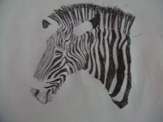
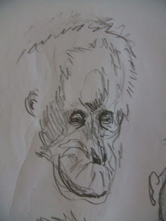
Another week at the zoo! This week i decided to switch things up. Now I have switched from trying to worry about drawing everything as i see it and structured, to doing drawings that focus on capturing the essence of what i see instead of the form. Trying to get the general activity/pose the animal is doing and the mood expressed through the pose or even facial expression (more so with orangutans). I still study the structure visually and dont dismiss it but i figure if i can achieve the mood in my drawings the structure will weave its way in as a study it and start to notice it more. Also I will be studying it more at home which is when ill really do structure drawings.

Sunday, July 01, 2007

Me and Yu 2


After doing a few new unsuccessful colour attempts I realized I have been forgetting all the basic painting and colour principles that I know so I tried to take it back to a more painterly approach. I began by painting venom all red since that is the colour i imagine would be under his skin. Then I blocked him into the very main box planes of light and dark. After that I went over and did passes of lights and darks building them up. I came up with something I felt was pretty successful...then I looked up the actual cover that was published...wow was I off. Although I still feel my approach and outcome is way better then before I still have a long way to go. I dont know why I have such a problem with contrast and all my colours end up coming out pretty bland with little emotion in them. I guess it will come in time. But at least its getting better and I recognize it as a problem I can work on. It's another step forward in the right direction. 1 step down... ?a really long made up number to go...